Xamarin.Forms UI Challenges - Art Auction
It’s time for another Xamarin.Forms UI Challenge! This time we are going to see how we can reproduce a design I found over at Dribbble by Alex Pesenka.
Let’s break it down
The design has a reasonably complex layout involving animated popups and overlays, which makes it a good candidate for a Xamarin.Forms UI challenge.
Here is a little video of the animations in the design in motion:
It’s a little bit tricky to see what’s going on with all that zooming going on, but let’s break down the screens and see how we can lay it out in Xamarin.Forms.
Art Details Screen
This is the main screen of the applciation.
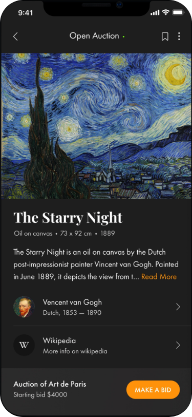 This screen is actually pretty basic, the key elements are:
- Root layout is a
Gridwith 2 rows. So the footer section can always be at the bottom of the page - The main section is contained within a
ScrollViewso that if it gets longer than the page it will allow us to scroll to see the additional information. - Then it’s pretty much a
StackLayoutto lay the elements down the screen
The intersting bits of this screen are:
- The top bit of text with the
Read Moresection which was provided by a very kind community contribution by Pedro Jesus. It’s a custom control with a couple of bindable properties which specify theMaxLengthof the label and aReadMoreproperty which specifies the color of the readmore text. When the text is set it creates aFormattedTextwith aSpanfor both the text and the Read More section. You can see the code here. - The Vincent Van Gogh image got the circular treatment thanks to James Montemagno’s ImageCirclePlugin
- The Wikipedia icon is a SVG. In Android it’s an
xmlfile that sits under thedrawablefile and in iOS it is provided by an AssetCatalog which creates a Vector from a PDF.
The Popup Bits
The nicest part of this screen is the fading and popup that happens when you press the MAKE A BID button. The idea is to have the main part of the screen fade out, whilst a popup flies in from the bottom.
The fading is achieved by having a BoxView that covers the entire screen which we can adjust the opacity of.
<BoxView
    x:Name="PageFader"
    Grid.Row="0"
    Grid.RowSpan="1"
    BackgroundColor="{StaticResource PageFadeColor}"
    IsVisible="false"
    Opacity="0">
    <BoxView.GestureRecognizers>
        <TapGestureRecognizer Tapped="PageFader_Tapped" />
    </BoxView.GestureRecognizers>
</BoxView>
When the user taps the button at the bottom of the screen the PageFader becomes visible via changing it’s opacity and visibility. At the same time it animates in the BidPopup from the bottom of the screen by animating it’s TranslationY property via the TranslateTo method.
private void BidPopupButton_Clicked(object sender, EventArgs e)
{
    var pageHeight = Height;
    var firstSection = BidPopup.FirstSectionHeight;
    PageFader.IsVisible = true;
    PageFader.FadeTo(1, AnimationSpeed, Easing.SinInOut);
    BidPopup.TranslateTo(0, pageHeight-firstSection, AnimationSpeed, Easing.SinInOut);
}
The BidPopup only animates in half way though, because it’s a two stage popup. There is a property called FirstSectionHeight on the BidPopup which tells us how high the first popup should be.
Next, if the the user taps on the PageFader (so the background outsie the popup) it will Translate the BidPopup down off the bottom of the screen and then fade the PageFader out.
private async void PageFader_Tapped(object sender, EventArgs e)
{
    BidPopup.TranslateTo(0, Height, AnimationSpeed, Easing.SinInOut);
    ArtistDetailsPopup.TranslateTo(0, Height, AnimationSpeed, Easing.SinInOut);
    await PageFader.FadeTo(0, AnimationSpeed, Easing.SinInOut);
    PageFader.IsVisible = false;
}
The Bid Popup
This is a ContentView that pops up from the bottom of the main screen. The tricky thing about this screen is that it happens in two “phases”. The first tap, brings in the gray section, then if the user taps again, it expands further to show the extended orange section.
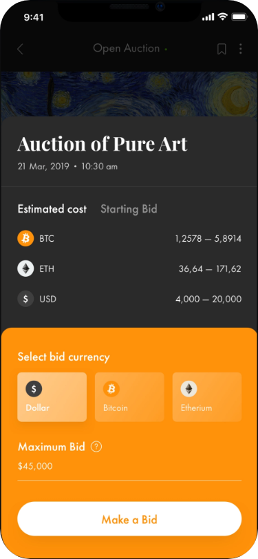
It looks kind of tricky, but the way the multi-stage popup works is to have a property on the ContentView which exposes the height of the FirstSection.
public double FirstSectionHeight
{
    get
    {
        return FirstSection.Height;
    }
}
And an event that is raised when the user taps on the first section, so that it knows to popup to it’s larger size.
public delegate void ClickExpandDelegate();

public ClickExpandDelegate OnExpandTapped { get; set; }

private void FirstSection_Tapped(object sender, EventArgs e)
{
    OnExpandTapped?.Invoke();
}
On the MainPage it listens for this event to animate the ContentView in to it’s full height.
protected override void OnAppearing()
{
    base.OnAppearing();
    BidPopup.OnExpandTapped += ExpandPopup;
    ArtistDetailsPopup.OnExpandTapped += ExpandArtistDetails;
}

private void ExpandPopup()
{
    var height = BidPopup.Height;
    BidPopup.TranslateTo(0, this.Height - height, AnimationSpeed, Easing.SinInOut);
}
The rounded corners at the top of the page are achieved by the awesome CornerRadius properties of a BoxView which allows us to control the rounding of each corner.
The other part that is interesting is the gradient backgrounds on the buttons, which is achieved by using the magnificent PancakeView control by Steven Thewissen.
Artist Details Popup
The layout of this screen is fairly simple as well. Technically, it’s a content view, which animates over the main page when the user taps on the artist name in the main page. Let’s have a look at it.
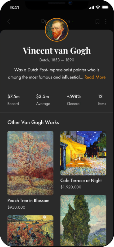 Most of the screen is just regular layouts using
 Grid and StackLayout. The cool bit is the staggered list which shows the artists works. This was a lovely implementation contributed by Lachlan Gordon. At it’s core it’s a FlexLayout with a BindableLayout of art works that sits within a ScrollView. Nice and simple, but super effective. (just the way code should be)
<ScrollView
    Grid.Row="9"
    Padding="5"
    BackgroundColor="{StaticResource LightBackgroundColor}">
    <StackLayout>
        <Label
            Margin="5"
            FontAttributes="Bold"
            Style="{StaticResource BodyText}"
            Text="Other Van Gogh Works" />
        <FlexLayout
            BindableLayout.ItemsSource="{Binding ArtWorks}"
            Direction="Column"
            HeightRequest="930"
            HorizontalOptions="Center"
            Wrap="Wrap">
            <BindableLayout.ItemTemplate>
                <DataTemplate>
                    <StackLayout Padding="5">
                        <ImageButton
                            Aspect="AspectFill"
                            CornerRadius="10"
                            HeightRequest="{Binding Height}"
                            Source="{Binding ImagePath}"
                            VerticalOptions="Start" />
                        <Label Style="{StaticResource BodyText}" Text="{Binding Name}" />
                        <Label
                            Margin="0,0,0,10"
                            Style="{StaticResource SubtitleText}"
                            Text="{Binding Path=Price, StringFormat='{0:C}'}" />
                    </StackLayout>
                </DataTemplate>
            </BindableLayout.ItemTemplate>
        </FlexLayout>
    </StackLayout>
</ScrollView>
Styling
Custom Fonts were used to give the all improtant visual style we wanted. Also using Application Styles were used to make it easier to get consistent colors. Here is the Styles used:
    <Application.Resources>

        <Color x:Key="BackgroundColor">#1F1E1E</Color>
        <Color x:Key="LightBackgroundColor">#292828</Color>
        <Color x:Key="ForegroundTextColor">White</Color>
        <Color x:Key="SubtitleTextColor">#C5C4C4</Color>
        <Color x:Key="AccentColor">#FF910A</Color>
        <Color x:Key="LightAccentColor">#FFC57E</Color>
        <Color x:Key="PageFadeColor">#AA000000</Color>
        <Color x:Key="HighlightGradientStart">#ffca8a</Color>
        <Color x:Key="HighlightGradientEnd">#ffba67</Color>
        <Color x:Key="NonHighlightGradientStart">#ffad4a</Color>
        <Color x:Key="NonHighlightGradientEnd">#ff9d24</Color>

        <OnPlatform x:Key="TitleFontFamily" x:TypeArguments="x:String">
            <On Platform="iOS" Value="Old Standard TT" />
            <On Platform="Android" Value="OldStandard-Bold.ttf#Old Standard TT" />
        </OnPlatform>

        <OnPlatform x:Key="BodyFontFamily" x:TypeArguments="x:String">
            <On Platform="iOS" Value="Questrial" />
            <On Platform="Android" Value="Questrial-Regular.ttf#Questrial" />
        </OnPlatform>


        <Style TargetType="Grid">
            <Setter Property="RowSpacing" Value="0" />
            <Setter Property="ColumnSpacing" Value="0" />
        </Style>

        <Style x:Key="TitleText" TargetType="Label">
            <Setter Property="TextColor" Value="{StaticResource ForegroundTextColor}" />
            <Setter Property="FontFamily" Value="{StaticResource TitleFontFamily}" />
            <Setter Property="FontSize" Value="30" />
        </Style>

        <Style x:Key="SubtitleText" TargetType="Label">
            <Setter Property="TextColor" Value="{StaticResource SubtitleTextColor}" />
            <Setter Property="FontFamily" Value="{StaticResource BodyFontFamily}" />
            <Setter Property="FontSize" Value="Small" />
        </Style>

        <Style x:Key="BodyText" TargetType="Label">
            <Setter Property="TextColor" Value="{StaticResource ForegroundTextColor}" />
            <Setter Property="FontFamily" Value="{StaticResource BodyFontFamily}" />
            <Setter Property="FontSize" Value="Medium" />
        </Style>

        <x:Double x:Key="LinkImageSize">50</x:Double>
        <x:Double x:Key="LinkImageCornerSize">25</x:Double>
    </Application.Resources>
The Final Result
I think we could call this Xamarin.Forms UI Challenge a success. It does highlight that you can achieve some pretty amazing things without having to resort to custom renderers. Layouts, Styles and Animations for the win!
iOS Version
Android Version
Get the code
All the code is available open source on GitHub at https://github.com/kphillpotts/ArtAuction/.
Techniques Used
- ImageCirclePlugin
- Xamarin.Forms Animations
- BindableProperties
- PancakeView
- Custom Fonts
- XAML Styles and Resources
- FlexLayout
Watch me code it
I actually did this UI Challenge live over Twitch, so if you want to watch hours of me coding this up then check out these recordings.
Part 1 - Missing in action
(NOTE: Because I’m an idiot and didn’t back up my files from Twitch, I lost the first session).
Part 2
Part 3
Also, if you want to catch me doing other live coding things, with Xamarin and Azure follow me on Twitch. It’s a great platform where we can chat as we build software, ask questions, submit code). Follow me at https://www.twitch.tv/kymphillpotts and come join in the fun!
Techniques Used
- ImageCirclePlugin
- Xamarin.Forms Animations
- BindableProperties
- PancakeView
- Custom Fonts
- XAML Styles and Resources
- FlexLayout
I hope these posts are useful for you, feel free to leave me a comment below or reach out to me via Twitter.
Until next time, Happy Coding
❤ Kym