Xamarin.Forms UI Challenges - Pizza Shop
Pizza is like the entire food pyramid. And This Xamarin UI Challenge, like our friend the pizza, has lots of delicious ingredients including animations, transitions, custom buttons, fonts and a sprinkle of SkiaSharp. Nom Nom.
The Design

This is a great looking design called Pizza Shop app Interaction created by Bidyut Kumar Bera. It’s a lovely playful design that uses thoughtful animations and transitions to enhance the user experience of the app.
Animations should always serve a purpose
The key elements we will focus on in this challenge are:
- Flying pizzas around the screen using an animation state helper
- Custom stepper button with flip up labels
- “Chomp Button” when a pizza is added to the cart
Basic Page Layout
The main page of the application uses a Grid as its main container which is fine for most of the elements. However, in order to control over the position of the flying pizza another key element is using an AbsoluteLayout which allows us to have precise control of the pizza.
Flying Pizzas
In this design there are ingredients flying all over the screen. To simplify this we use an AnimationStateEngine class to control the positions of the pizza for various states.
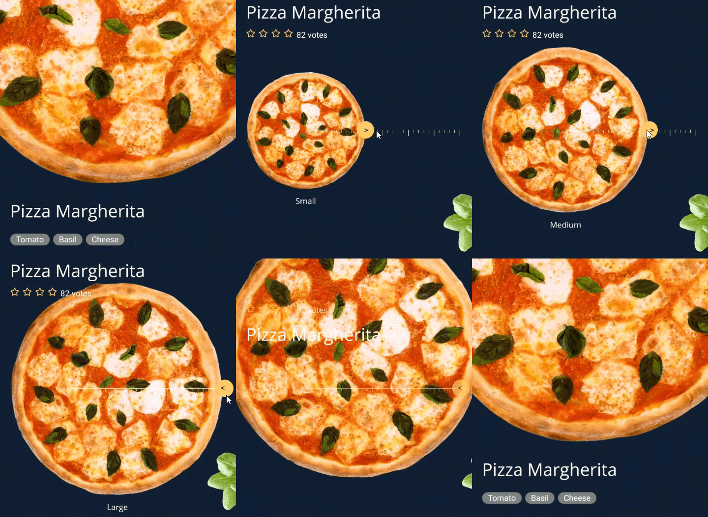
There are five states which are represented in an enumeration:
enum State
{
    Start,
    Entrance,
    Small,
    Medium,
    Large
}
We use a custom AnimationStateEngine to control elements for each of the states. There is quite a bit of code to setup the various elements, but as an example for the pizza we setup positions and rotation for the pizza for each state.
animState = new AnimationStateMachine();

animState.Add(State.Start, new ViewTransition[]
{
    new ViewTransition(Pizza, AnimationType.Layout, startRect),
    new ViewTransition(Pizza, AnimationType.Rotation, 0),
    ...
}

animState.Add(State.Entrance, new ViewTransition[]
{
    new ViewTransition(Pizza, AnimationType.Layout, entranceRect),
    new ViewTransition(Pizza, AnimationType.Rotation, 20),
    ...
}

animState.Add(State.Small, new ViewTransition[]
{
    new ViewTransition(Pizza, AnimationType.Layout, smallRect),
    new ViewTransition(Pizza, AnimationType.Rotation, 45),
    ...
}

animState.Add(State.Medium, new ViewTransition[]
{
    new ViewTransition(Pizza, AnimationType.Layout, mediumRect),
    new ViewTransition(Pizza, AnimationType.Rotation, 90),
    ...
}

animState.Add(State.Large, new ViewTransition[]
{
    new ViewTransition(Pizza, AnimationType.Layout, largeRect),
    new ViewTransition(Pizza, AnimationType.Rotation, 135),
    ...
}
Then to do the animation it’s just a matter of activating a particular state and the AnimationStateEngine will handle the translations for us.
private void PizzaRulerThumb_Tapped(object sender, EventArgs e)
{
    // navigate to the next state
    switch (animState.CurrentState)
    {
        case State.Small:
            animState.Go(State.Medium);
            break;
        case State.Medium:
            animState.Go(State.Large);
            break;
        case State.Large:
            animState.Go(State.Small);
            break;
    }
}
As I said, there is quite a bit more in the code and you should definitely checkout the code if you are interested in the inner workings of it. But hopefully that gives you enough of a clue to see the benefits of this sort of approach.
Custom stepper
The design calls for a fancy stepper control that rotates the quantity up and down.

The main layout of this is a Grid. The first column just has the the Label. So not particularly interesting.
<Grid
    x:Name="QuantitySelect"
    Margin="20,30"
    ColumnSpacing="40"
    VerticalOptions="End">
    <Grid.ColumnDefinitions>
        <ColumnDefinition Width="Auto" />
        <ColumnDefinition Width="*" />
    </Grid.ColumnDefinitions>

    <Label
        FontSize="18"
        Style="{StaticResource DescriptionText}"
        Text="Quantity"
        VerticalOptions="Center" />
    ...
</Grid>
The second column is where the magic happens. To create the buttons and outline for the stepper button, we just use a frame and a couple of buttons with appropriate Border and CornerRadius settings. But interestingly here we don’t enclose the buttons inside the frame, rather we use the magic of Grid to have the elements overlapping each other.
<Frame
    Grid.Column="1"
    Padding="0"
    BackgroundColor="Transparent"
    BorderColor="White"
    CornerRadius="25"
    HasShadow="False"
    HeightRequest="50"
    HorizontalOptions="Fill"
    VerticalOptions="Center" />
<Button
    x:Name="DecreaseButton"
    Grid.Column="1"
    Margin="10,0,0,0"
    Clicked="DecreaseButton_Clicked"
    HorizontalOptions="Start"
    Style="{StaticResource QuantityButton}"
    Text="-"
    VerticalOptions="Center" />
<Button
    x:Name="IncreaseButton"
    Grid.Column="1"
    Margin="0,0,10,0"
    Clicked="IncreaseButton_Clicked"
    HorizontalOptions="End"
    Style="{StaticResource QuantityButton}"
    Text="+"
    VerticalOptions="Center" />

    <controls:FerrisLabel
        x:Name="QuantityLabel"
        Grid.Column="1"
        HorizontalOptions="Center"
        Text="1"
        TextStyle="{StaticResource QuantityStyle}"
        VerticalOptions="Center" />
The Ferris Label Control
Now for the rotating label. We put this into a custom control because it’s used in multiple places in the design so we can reuse it. It’s called a FerrisLabel which is kind of a play on the words that it’s like a carousel but vertical.
It’s actually quite simple. It uses two labels and a couple bindable properties that respond to when the text changes to kick off an animation.
<Grid
    x:Class="Pizza.Controls.FerrisLabel"
    xmlns="http://xamarin.com/schemas/2014/forms"
    xmlns:x="http://schemas.microsoft.com/winfx/2009/xaml"
    xmlns:controls="clr-namespace:Pizza.Controls"
    xmlns:mc="http://schemas.openxmlformats.org/markup-compatibility/2006">
    <Label
        x:Name="CurrentLabel"
        HorizontalOptions="Center"
        VerticalOptions="Center" />
    <Label
        x:Name="NextLabel"
        HorizontalOptions="Center"
        Opacity="0"
        VerticalOptions="Center" />
</Grid>
Behind the scenes, we have an AnimationOffset property which controls which way the animations should go (up or down, or even diagonal if you want). Also a BindableProperty for the Text, which kicks off the animations when it detects a change.
        public Point AnimationOffset { get; set; }

        public static readonly BindableProperty TextProperty = BindableProperty.Create(nameof(Text), typeof(string), typeof(FerrisLabel), default(string), propertyChanged: OnTextChanged);
        public string Text
        {
            get
            {
                return (string)GetValue(TextProperty);
            }

            set
            {
                SetValue(TextProperty, value);
            }
        }

        static void OnTextChanged(BindableObject bindable, object oldValue, object newValue)
        {
            try
            {
                var control = (FerrisLabel)bindable;

                var value = (string)newValue;

                control.ApplyText((string)oldValue, value);
            }
            catch (Exception ex)
            {
                // TODO: Handle exception.
            }
        }
So from there it’s just a matter of doing the animations:
async void ApplyText(string oldValue, string newValue)
{
    // update the labels
    Current.Text = oldValue;
    Current.TranslationY = 0;
    Current.TranslationX = 0;
    Current.Opacity = 1;

    // set the starting positions
    Current.TranslationY = 0;
    _ = Current.TranslateTo(-AnimationOffset.X, -AnimationOffset.Y);
    _ = Current.FadeTo(0);

    // animate in the next label
    Next.Text = newValue;
    Next.TranslationY = AnimationOffset.Y;
    Next.TranslationX = AnimationOffset.X;
    Next.Opacity = 0;
    _ = Next.TranslateTo(0, 0);
    await Next.FadeTo(1);

    // recycle the views
    Current = NextLabel;
    Next = CurrentLabel;
}
So back in our calling code all we need to do is update the property and the animations get triggered from the bindable property.
private async void DecreaseButton_Clicked(object sender, EventArgs e)
{
    if (currentQuantity == 1)
        return;
    else
        currentQuantity--;

    QuantityLabel.AnimationOffset = new Point(0, -20);
    QuantityLabel.Text = currentQuantity.ToString();
}

private async void IncreaseButton_Clicked(object sender, EventArgs e)
{
    currentQuantity++;
    QuantityLabel.AnimationOffset = new Point(0, 20);
    QuantityLabel.Text = currentQuantity.ToString();
}
Chomping Pizza Button
This is my favorite piece of animation. It’s a very playful way of adding the pizza to the shopping cart.
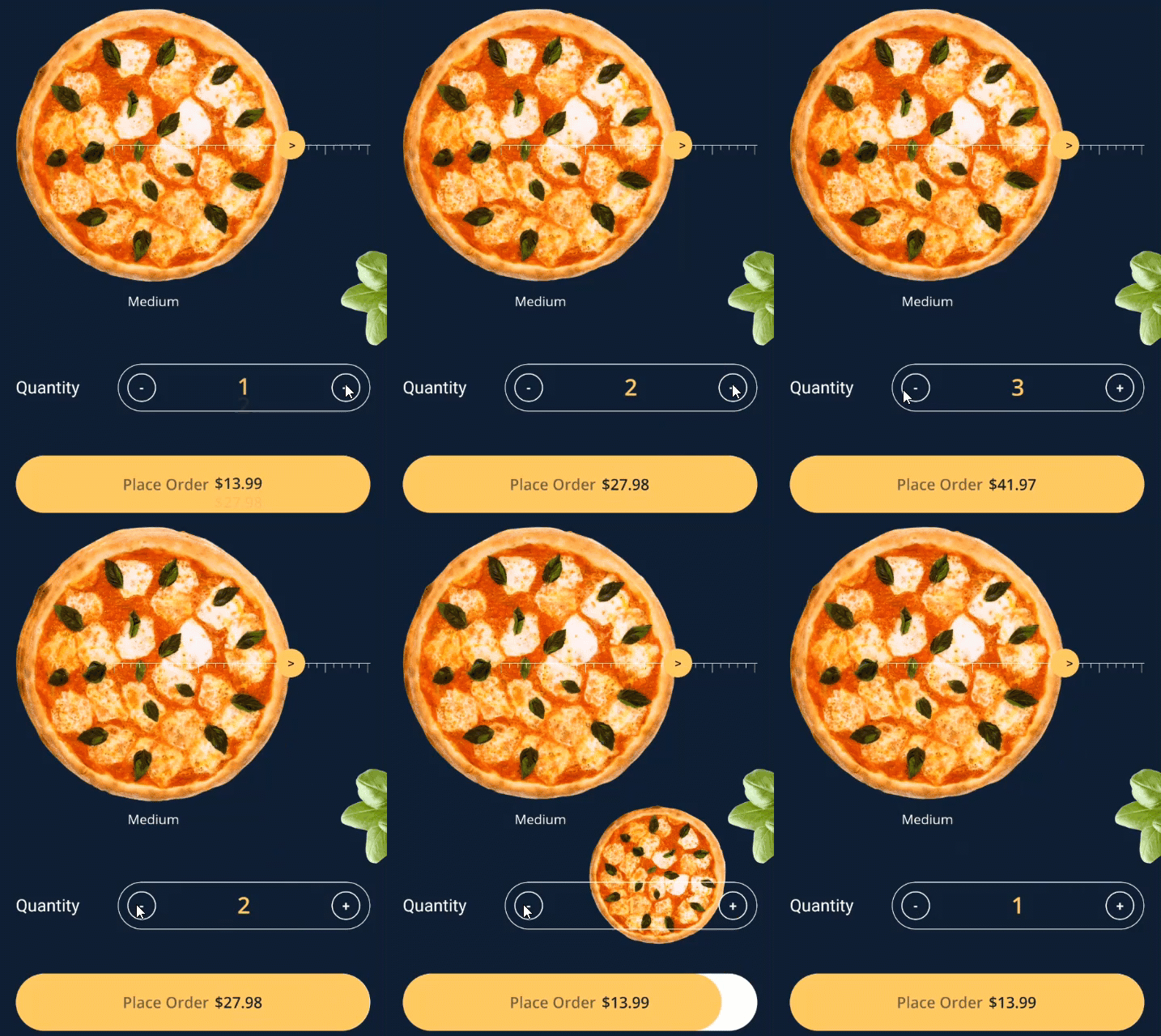
The key to this animation is having a hidden FlyingPizza image, which is exactly over top of the normal pizza image. Once the Pizza needs to fly, we make it it visible, animate its LayoutBounds so that it flies down to the bottom right of the PlaceOrderButton. Then at the same time, adjust the bounds of the Button to allow a space for the pizza. There is also a little bit of animation to rotate the pizza as it’s flying and as it lands on the button.
private async Task PizzaFly()
{
    // check if the pizza is already flying
    if (FlyingPizza.IsVisible) return;

    // eat the pizza
    FlyingPizza.IsVisible = true;

    // position pizza
    AbsoluteLayout.SetLayoutBounds(FlyingPizza, Pizza.Bounds);

    // get the bounds of the button
    var buttonBounds = PlaceOrderButton.Bounds;

    // work out where it needs to fly to?
    var size = new Size(buttonBounds.Height, buttonBounds.Height);
    var location = new Point(buttonBounds.Right - size.Width, buttonBounds.Top);
    var chompBounds = new Rectangle(location, size);

    // animate the pizza down
    _ = FlyingPizza.LayoutTo(chompBounds, 500, Easing.SinInOut);
    _ = FlyingPizza.RelRotateTo(90, 500, Easing.SinInOut);

    // do the button chomp
    var buttonChompBounds = new Rectangle(PlaceOrderButton.Bounds.Location,
        new Size(PlaceOrderButton.Width - buttonBounds.Height, buttonBounds.Height));
    await PlaceOrderButton.LayoutTo(buttonChompBounds, 500, Easing.SinInOut);

    _ = FlyingPizza.RelRotateTo(-90, 500, Easing.SinInOut);

    // close the button chomp
    await PlaceOrderButton.LayoutTo(buttonBounds, 500, Easing.SinInOut);

    FlyingPizza.IsVisible = false;
}
Not terribly complicated code, but it’s a really nice effect. To move it back out of the button when the quantity decreases there is another method called RegurgitatePizza which pretty much does the same thing but in reverse.
The Ruler
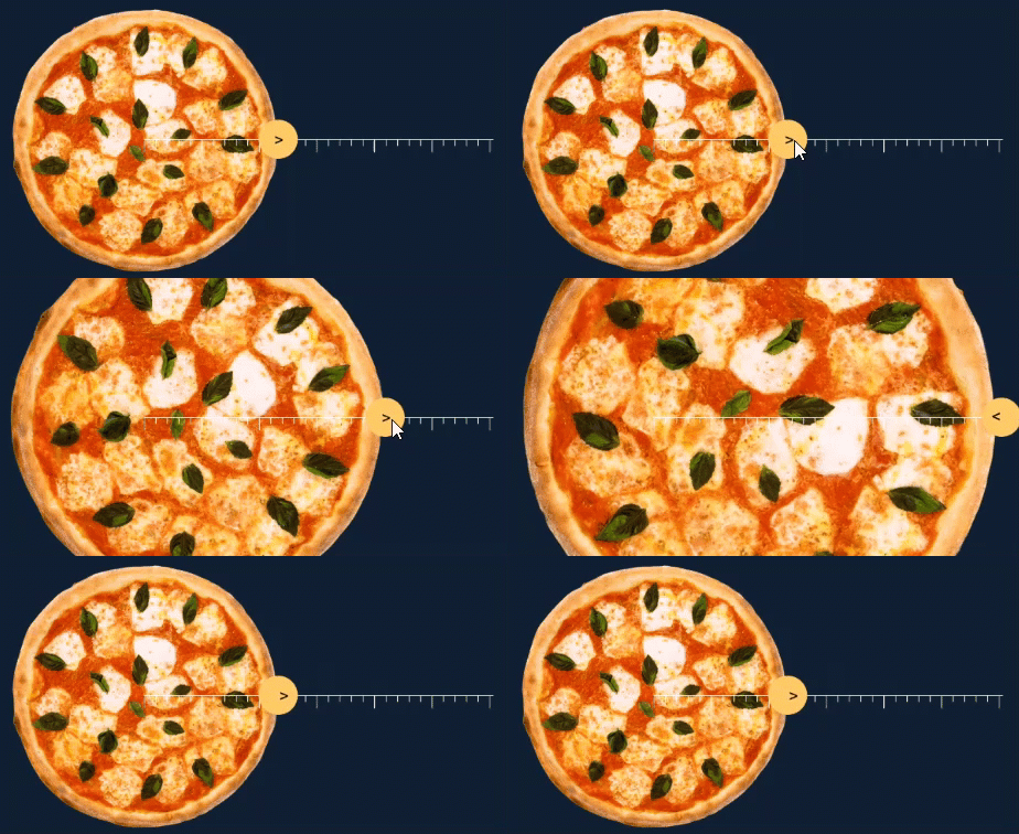
As with a lot of complex designs there are often things which require some custom graphics. In this case the ruler for the pizza size is rendered using SkiaSharp.
SKPaint rulerPaint = new SKPaint()
{
    Color = SKColors.White,
    StrokeWidth = 2,
    Style = SKPaintStyle.Stroke
};

private void PizzaRuler_PaintSurface(object sender, SkiaSharp.Views.Forms.SKPaintSurfaceEventArgs e)
{
    var canvas = e.Surface.Canvas;

    // draw the main ruler line
    canvas.DrawLine(new SKPoint(0, 0), new SKPoint(e.Info.Width, 0), rulerPaint);

    // draw the ticks
    var numberOfTicks = 30;
    var distanceBetweenTicks = e.Info.Width / numberOfTicks;

    for (int i = 0; i <= numberOfTicks; i++)
    {
        // every 5th tick is full height
        float tickHeight = (i % 5) == 0 ? e.Info.Height : (float)(e.Info.Height / 2);

        canvas.DrawLine(
            new SKPoint(i * distanceBetweenTicks, 0),
            new SKPoint(i * distanceBetweenTicks, tickHeight),
            rulerPaint);
    }
}
And finally there is the button which appears on the ruler, which is only interesting in so much that it has a constant animation showing the direction of the arrow. You can’t achieve this with the normal Animation extension methods but with a custom animation you can do this very easily by just setting the repeat to true:
// create continuous animation for thumb
pulse = new Animation();
pulse.Add(0, .5, new Animation(a => PizzaThumbLabel.TranslationX = a, 0, 5, Easing.SinInOut));
pulse.Add(.5, 1, new Animation(a => PizzaThumbLabel.TranslationX = a, 5, 0, Easing.SinInOut));
// start the animation continuously
pulse.Commit(this, "pulse", length:500, repeat: () => true);
Summary
Okay, so that’s the key elements in this UI Challenge. It was a lot of fun to put together and the final result is pretty delicious.
Get the code
There are some complexities which I haven’t gone into in this blog post, but I’ve covered most of the interesting ingredients. All the code is available open source on my github.
Watch me code it
I actually did this UI Challenge live over Twitch, so if you want to watch hours of me coding this up then check out these recordings.
If you want to catch me doing other live coding things follow me on Twitch. It’s a great platform where we can chat as we build software. Follow me at https://www.twitch.tv/kymphillpotts and come join in the fun!
If you can’t make it to the Twitch streams, then I also upload the videos to my YouTube Channel
I hope these posts are useful for you, feel free to leave me a comment below or reach out to me via Twitter.
Until next time, Happy Coding
❤ Kym
