Xamarin.Forms UI Challenges - RottenUI
This UI Challenge is all about composing overlapping elements in Xamarin.Forms. Overlapping elements is one of the subtle elements that can enhance a design and make it pop.
The Design
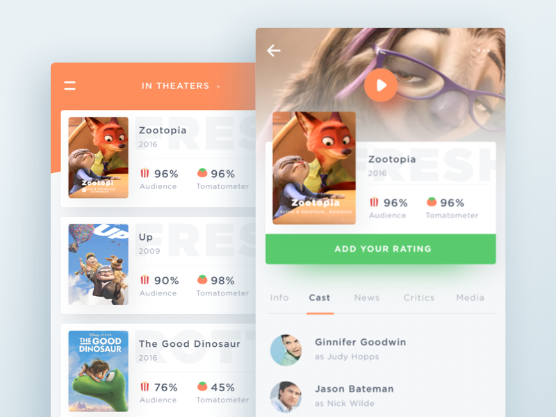
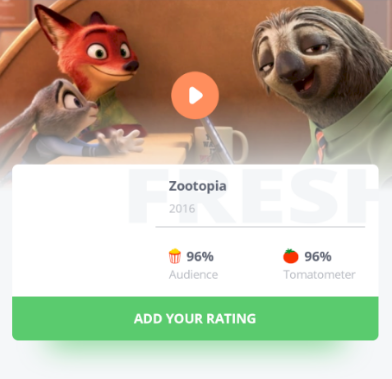
This is a great looking design called Rottentomatoes App Concept created by Ghani Pradita. Even though the design has two screens in it, the focus of this chanllenge was the details page.
The key elements we will focus on in this challenge are:
- Overlapping elements
- Custom rendering of shadows
- Tabbed bottom content
Basic Page Layout
If you have checked out any of my other Xamarin.Forms UI Challenges, you are probably aware that I really enjoy using a Grid as the main layout container for pages. At the surface the Grid seems to be quite limited in terms of functionality, but the Grid provides a couple of great benefits:
- Responsive design
- Overlapping elements
The Grid makes a perfect layout for this sort of design. The Grid occupies the page, and is divided into two rows. The first row is for the background header of 200 units, whilst the second row occupies the rest of the page and is where the main content goes.
<Grid>
    <Grid.RowDefinitions>
        <RowDefinition Height="200" />
        <RowDefinition Height="*" />
    </Grid.RowDefinitions>
    ...
</Grid>
Okay, so let’s break this down into the various sections.
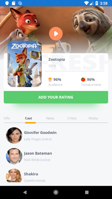
The Header
The header for the page has a few overlapped components. First we have the background image, over that we have a play button and a white overlay.

This is nice and simple to implement with a Grid because we can just put the elements into the same cell of the Grid to have them overlay. In this situation, order is important because the order that you put the elements in your xaml file indicates the z-order. Sometimes this can be a little confusing because the elements you want to be in front will actually go down the bottom of your xaml.
<Image
    Aspect="AspectFill"
    HeightRequest="200"
    Source="{Binding BackdropUrl}" />

<Image
    Aspect="Fill"
    HeightRequest="100"
    Source="white_gradient"
    VerticalOptions="End" />

<Image
    HorizontalOptions="Center"
    Source="play_button"
    VerticalOptions="Center" />
Probably the only interesting point here is the white gradient down the bottom of the header. There are a few different ways you could implement this. First, and probably the technically best solution is to use SkiaSharp to render a transparent to white gradient. In this case though, I have just implemented this with a very simple .png file with a gradient and overlayed it over the image. Sometimes simple just works.
The Movie Details
Okay onto the more interesting part, which is the movie details.
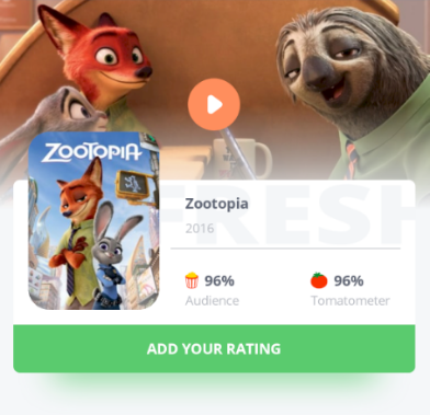
This get’s a little bit funky because we have numerous elements overlapping within the details section as well as the whole thing overlapping the header. The trick here is that the details of the page actually sit in Row 0 of the table but span across 2 rows. (hence it sits above and overlapping the header).
<Grid
    Grid.Row="0"
    Grid.RowSpan="2"
    Margin="14,172,14,0"
    ColumnSpacing="0"
    IsClippedToBounds="True"
    RowSpacing="0">
    <Grid.RowDefinitions>
        <RowDefinition Height="138" /> <!-- movie detail box -->
        <RowDefinition Height="46" />  <!-- rating button row -->
        <RowDefinition Height="46" />  <!-- spacing between button and tab-->
        <RowDefinition Height="*" />   <!-- rest of the page -->
    </Grid.RowDefinitions>
    <Grid.ColumnDefinitions>
        <ColumnDefinition Width="150" />
        <ColumnDefinition Width="*" />
    </Grid.ColumnDefinitions>
    ...
There are a couple of things to note in here.
- The
Margin="14,172,14,0"is what brings the content down so that it doesn’t sit entirely at the top of the page. - The
IsClippedToBounds="True"is what allows the FRESH text to be clipped to the grid.
Okay, let’s break it down even further into the elements:
Movie Information Container
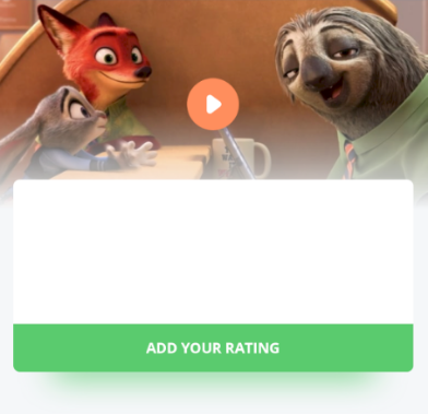
The main container for the movie information is a white BoxView and a green Boxview for the button with a combination of CornerRadius to make it look pretty.
<!-- white panel -->
<BoxView
    Grid.Row="0"
    Grid.ColumnSpan="2"
    BackgroundColor="White"
    CornerRadius="6,6,0,0" />

<!-- the add your rating button -->
<BoxView
    Grid.Row="1"
    Grid.ColumnSpan="2"
    BackgroundColor="{StaticResource ButtonColor}"
    CornerRadius="0,0,6,6" />
<Label
    Grid.Row="1"
    Grid.ColumnSpan="2"
    HorizontalOptions="Center"
    Style="{StaticResource MovieName}"
    Text="ADD YOUR RATING"
    TextColor="White"
    VerticalOptions="Center" />

<!-- button shadow -->
<skia:SKCanvasView
    Grid.Row="2"
    Grid.RowSpan="2"
    Grid.ColumnSpan="2"
    PaintSurface="SKCanvasView_PaintSurface" />
The hardest part was the shadow for the button. If you look at it carefully, you’ll notice that it’s actually smaller than the button and has a big blur. I had to do this with SkiaSharp - because that’s where I go when I need to render funky things ;-)
private void SKCanvasView_PaintSurface(object sender, SkiaSharp.Views.Forms.SKPaintSurfaceEventArgs args)
{
    SKImageInfo info = args.Info;
    SKSurface surface = args.Surface;
    SKCanvas canvas = surface.Canvas;

    canvas.Clear();

    using (SKPaint paint = new SKPaint())
    {
        // define the color for the shadow
        SKColor shadowColor = Color.FromHex("#5ACB6E").ToSKColor();

        paint.IsDither = true;
        paint.IsAntialias = true;
        paint.Color = shadowColor;

        // create filter for drop shadow
        paint.ImageFilter = SKImageFilter.CreateDropShadow(
            dx: 0, dy: 0,
            sigmaX: 40, sigmaY: 40,
            color: shadowColor,
            shadowMode: SKDropShadowImageFilterShadowMode.DrawShadowOnly);

        // define where I want to draw the object
        var margin = info.Width / 10;
        var shadowBounds = new SKRect(margin, -40, info.Width - margin, 10);
        canvas.DrawRoundRect(shadowBounds, 10, 10, paint);
    }
}
Fortunately, Skia is amazing and allows us to easily do things like create a shadow effect.
Movie Information
The next bit is the movie information and ratings inside the container. This is really just combination of Grid and StackLayout.
<!--  movie information  -->
<Grid Grid.Row="0" Grid.Column="1">
    <Grid.RowDefinitions>
        <RowDefinition Height="*" />
        <RowDefinition Height="*" />
    </Grid.RowDefinitions>

    <Image
        Margin="0,0,-55,0"
        Source="Fresh"
        TranslationX="-28" />

    <StackLayout Margin="14,0,0,0" VerticalOptions="Center">
        <Label Style="{StaticResource MovieName}" Text="{Binding Title}" />
        <Label Style="{StaticResource SubText}" Text="{Binding ReleaseDate}" />
    </StackLayout>
    <BoxView
        Margin="0,0,14,0"
        HeightRequest=".5"
        VerticalOptions="End"
        Color="{StaticResource SubTextColor}" />

    <Grid Grid.Row="1">
        <Grid.ColumnDefinitions>
            <ColumnDefinition Width="*" />
            <ColumnDefinition Width="*" />
        </Grid.ColumnDefinitions>
        <StackLayout Margin="14,0,0,0" VerticalOptions="Center">
            <StackLayout Orientation="Horizontal">
                <Image Source="rotten_popcorn" />
                <Label Style="{StaticResource MovieName}" Text="{Binding AudienceScore, StringFormat='{0:}%'}" />
            </StackLayout>
            <Label
                Margin="0,-5,0,0"
                Style="{StaticResource SubText}"
                Text="Audience" />
        </StackLayout>

        <StackLayout
            Grid.Column="1"
            Margin="14,0,0,0"
            VerticalOptions="Center">
            <StackLayout Orientation="Horizontal">
                <Image Source="rotten_tomato" />
                <Label Style="{StaticResource MovieName}" Text="{Binding TomatometerScore, StringFormat='{0:}%'}" />
            </StackLayout>
            <Label
                Margin="0,-5,0,0"
                Style="{StaticResource SubText}"
                Text="Tomatometer" />
        </StackLayout>

    </Grid>
</Grid>
For the FRESH text unfortunately I couldn’t see a way of getting that to work with a label because the font spacing and size is very specific, so instead I used an image like this:

and then translated it using a negative right margin (to make it wider than the cell) and then translated it to the left so that it would go under the poster.
<Image
    Margin="0,0,-55,0"
    Source="Fresh"
    TranslationX="-28" />
The Poster
And that just leaves us with the poster. I used the most excellent PancakeView to get the rounded corners. But what is interesting about this is that because it’s got to go over all the other information it is the very last thing that appears in the xaml even though it’s at the top.
<pancake:PancakeView
    Grid.RowSpan="2"
    Margin="28,126,0,0"
    CornerRadius="20"
    HeightRequest="170"
    HorizontalOptions="Start"
    IsClippedToBounds="True"
    VerticalOptions="Start"
    WidthRequest="125">
    <Image
        Aspect="AspectFill"
        HeightRequest="170"
        HorizontalOptions="Start"
        Source="{Binding PosterUrl}"
        VerticalOptions="Start"
        WidthRequest="125" />
</pancake:PancakeView>
The Tabbed Bottom Content
Alright, so that just leaves us with the bottom tabs. In Xamarin.Forms there is a TabbedPage, but not a tabbed view. There are a number of ones available in the Open Source community, but none that would deo exactly what I was after. But, it is super easy to create your own.
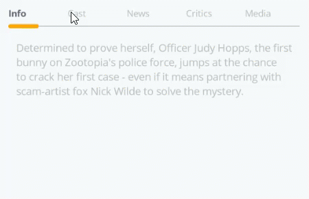
In our case we implemented this in it’s own ContentView so as not to bloat the size of the MainPage. It’s implemented in a file called DetailsSection.xaml. The layout for the tab headers is just a Grid with 5 columns. Each column has a Label which is shown on the Tab header.
<Grid Grid.Row="0">
    <Grid.ColumnDefinitions>
        <ColumnDefinition Width="*" />
        <ColumnDefinition Width="*" />
        <ColumnDefinition Width="*" />
        <ColumnDefinition Width="*" />
        <ColumnDefinition Width="*" />
    </Grid.ColumnDefinitions>

    <Label
        x:Name="InfoTab"
        Grid.Column="0"
        Style="{StaticResource SelectedTabLabel}"
        Text="Info">
        <Label.GestureRecognizers>
            <TapGestureRecognizer Tapped="TapGestureRecognizer_Tapped" />
        </Label.GestureRecognizers>
    </Label>
    <Label
        x:Name="CastTab"
        Grid.Column="1"
        Style="{StaticResource TabLabel}"
        Text="Cast">
        <Label.GestureRecognizers>
            <TapGestureRecognizer Tapped="TapGestureRecognizer_Tapped" />
        </Label.GestureRecognizers>
    </Label>
    ...
</Grid>
We also have the little orange element that moves with the selection. This is just a a couple of BoxView elements (which we will animate later)
<BoxView
    Grid.Row="1"
    HeightRequest="1"
    VerticalOptions="Center"
    Color="{StaticResource SubTextColor}" />
<BoxView
    x:Name="SelectionUnderline"
    Grid.Row="1"
    CornerRadius="2"
    HeightRequest="5"
    HorizontalOptions="Start"
    WidthRequest="40"
    Color="Orange" />
To be fair, there is a tiny bit of structure for the control by having a couple of collections for the headers and contents. We load these up in the constructor.
int selectionIndex = 0;

List<Label> tabHeaders = new List<Label>();
List<VisualElement> tabContents = new List<VisualElement>();

public DetailsSection()
{
    InitializeComponent();

    tabHeaders.Add(InfoTab);
    tabHeaders.Add(CastTab);
    tabHeaders.Add(NewsTab);
    tabHeaders.Add(CriticsTab);
    tabHeaders.Add(MediaTab);

    tabContents.Add(InfoContent);
    tabContents.Add(CastContent);
    tabContents.Add(NewsContent);
    tabContents.Add(CriticsContent);
    tabContents.Add(MediaContent);
}
For each of the headers labels we have TapGestureRecognizer that all call the same method. That method works out which index we have selected and then calls a method to do the tab switching.
private async void TapGestureRecognizer_Tapped(object sender, EventArgs e)
{
    var tabIndex = tabHeaders.IndexOf((Label)sender);
    await ShowSelection(tabIndex);
}

private async Task ShowSelection(int newTab)
{
    if (newTab == selectionIndex) return;

    // navigate the selection pill
    var selectdTabLabel = tabHeaders[newTab];
    _ = SelectionUnderline.TranslateTo(selectdTabLabel.Bounds.X, 0, 150, easing:Easing.SinInOut);

    // update the style of the header to show it's selcted
    var unselectedStyle = (Style)Application.Current.Resources["TabLabel"];
    var selectedStyle = (Style)Application.Current.Resources["SelectedTabLabel"];
    tabHeaders[selectionIndex].Style = unselectedStyle;
    selectdTabLabel.Style = selectedStyle;

    /// reveal the contents
    await tabContents[selectionIndex].FadeTo(0);
    tabContents[selectionIndex].IsVisible = false;
    tabContents[newTab].IsVisible = true;
    _ = tabContents[newTab].FadeTo(1); //ybadragon thanks!

    selectionIndex = newTab;
}
Just to cover off the key things that happen inside ShowSelection method above:
- We use a
TranslateToanimation to change the position of the orange indicator to the bounds of the selected header - We use the application resources to change the style of the TabHeader labels
- We fade out the existing tab content
- We fade in the new tab content
Summary
Okay, so that’s the key elements in this UI Challenge. It was definitely a fun UI to put together, and not too difficult when you break it apart into it’s elements. Just remember people, Grids are your friends!
Components Used
Get the code
All the code is available open source on my github.
Watch me code it
I actually did this UI Challenge live over Twitch, so if you want to watch hours of me coding this up then check out these recordings. And as a special bit of fun James Montemagno jumped in on the stream towards the end and shows a trick or two. Thanks James!
If you want to catch me doing other live coding things follow me on Twitch. It’s a great platform where we can chat as we build software, ask questions, submit code). Follow me at https://www.twitch.tv/kymphillpotts and come join in the fun!

If you can’t make it to the Twitch streams, then I also upload the videos to my YouTube Channel
I hope these posts are useful for you, feel free to leave me a comment below or reach out to me via Twitter.
Until next time, Happy Coding
❤ Kym